Nora Kuehner
fashion design consulting
Secretary General of IDEAS ACTIVE SPORTS DESIGN NETWORK
Presentation at Performance Days show in Munich/ Germany,
May 13, 2014
Colours & Trends
Update Winter 2015*16 and Preview Summer 2016
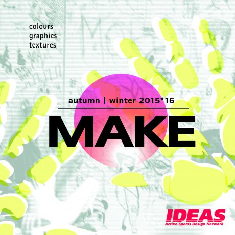
MAKE as the season´s keyword stands for the challenge to conquer new grounds, to ask new questions instead of answering to the existing ones and to appreciate diversity as a stimulating source of inspiration.
Moreover MAKE is the perfect guideline for developing amazing products with passion and know-how. The IDEAS colour stories for winter 2015*16 lend a fresh and powerful approach to the season.
Leave the beaten track and make your mark!
- momentum
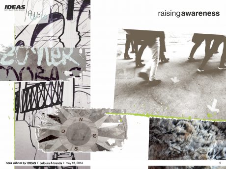
A raising awareness for what mankind is about to lose – high time to turn concepts into reality. Heading off with powerful strides.
fabrics Discreet classics play with slight variations in texture and surface detail. Subdued jacquards. Double-faces with highly contrasting faces. Matte density and fluid sturdiness. Finely waxed surfaces.
graphics Subtle yet racy modulations of sober geometries. Fragments of architecture turn into decorative, abstract patterns. Brush-strokes. Scratchy hand-drawn lines.
colour mood A refined palette of earthy grey tones contrasted by bursts of toxic green and muted turquoise. A subdued but never austere colour range.
- Get raw!
Material fascination and a love for the hand-crafted. Re-awakening human senses in urban landscapes.
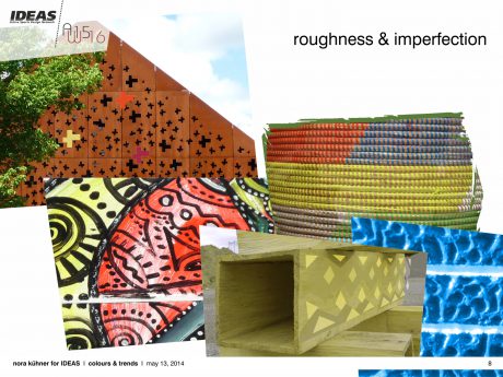
fabrics Careful material selection gains importance – raw and natural materiality is key to fabrics.
Haptic sensations. Rugged and expressive surfaces. Irregular blends of fibres. Double-brushed knits. Tufty fleeces. Fake fur. Hairy aspects for smooth softshells. Durable power stretch qualities with brushed backsides. Hand-crafted accessories.
graphics Organic motifs with corroded overprints. Winding lines and strict basket weaves. Tonal patterns inspired by stone walls. Precise laser-cut-outs add a sense of edginess to minimalistic geometry. Large-scale street-art scribbles. Scattered layers of mineral print motifs.
colour mood A colour palette in powerful harmony with a matte freshness. Warmed by shades of brick-red and spicy orange. Lush mossy green tones and dazzling blue underline the saturated vibrancy of this theme.
- Transformations
Signs of change – converting, completing, improving and beautifying the existing.
Interventions and transformations to adapt the existing to new concepts and individual needs.
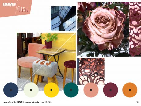
fabrics Materials focus on fluidity and flexibility. Matte fabrics get in motion. Highly stretchy fabrics. Engineered long-lasting knits and wovens with fluffy volume. Enlarged yarn-dyed woollen checks. High performance finishes add traces of use to dense textures. Merino/silk blends offer a touch of luxury combined with high-performance properties.
graphics Pattern inspiration derives both from the past and the future. Using motifs from natural and industrial settings to create unique all-overs filled with light and shadow. Translucent effects lend motion to scattered geometries. Strange encounters of baroque flowers and rusty industrial relics.
colour mood The sophisticated palette is divided in warm and cool tones – slightly off-balanced.
Solid burgundy, rust orange and delicately tanned rose set the tone. Gloomy dark green and midnight blue add drama to the scenery. Lifted by injections of light misty green and soft mustard yellow.
- Let´s play!
Reset. Shifting moods. Emphasizing flexibility and openness. Finding innovative solutions through play.
fabrics Fabrics feature a dry and crispy hand-feel. Foamy thickness of blended synthetics. Milky laminations. Superlight technical jacquards. Small geometric all-over patterns adorn high-pile and woollen fleeces. Brushed backsides for thermal retention. Embossed textures both for knits and wovens.
graphics Rigid but simple geometric patterns create shapes and volume. Multi-faceted and angular architectural structures are broken by transparent and blurry inserts. Pixelated edges. Curvy lines add movement to distorted multi-coloured stripes. Bold monochrome lettering.
colour mood Bright colours bubbling with playfulness set up a positive mood. Colours hard to be ignored – hot pink and coral pair with eye-popping green and brilliant turquoise. Flashes of blackened midnight blue underline the vividness of this colour range.
- fantasy boost
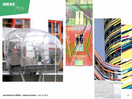
Celebrating creative deconstruction and limitless imagination. Manipulating the familiar, coming up with swirling amalgamations.
fabrics Fabrics experiment with complex and diverse structures, with natural fibres and eco-friendly synthetics. Developing a new visual approach to urban performance wear. Sculpting smooth curves with blends of wool and stretch. Playful melange look both for wovens and knits. Tactile double-faces. Matte coatings. Perforated finishes.
graphics Spontaneous and exuberant. A striking and sometimes surrealistic array of graphics – sharp geometric forms team with softly contoured botanical motifs. Photorealistic prints are embellished by hand-painted signs or placed splashes of colour. Slightly overloaded individual collages.
colour mood A moody mix of purple shades. Empowered by electric green and vibrant orange. Highlighted by light grey and frosted white. An energetic and vibrant mix reflecting perfectly the experimental mood of this theme.
- Maker´s Mark
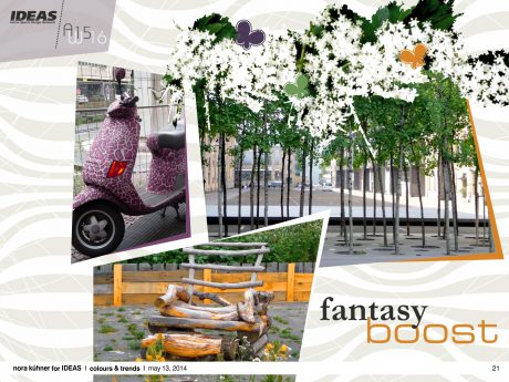
Off the beaten track – following the amazing flow of individuality.
fabrics Aiming to surprise – pushing the boundaries of performance fabrics. Offering highest comfort. Elaborated soft laminations. Ultrafine stretchy lightweights enhancing the freedom of movement. Porous coatings. Polished surfaces and metallic sheen.
graphics Humanizing digital drawing. The ever-fascinating beauty of hand-drawn scribbles. Allowing unexpected results. Lines in motion exploring the depth of space. Provoking surprises.
colour mood A relaxed and versatile theme vigorously on the move. The colour scheme focuses on shades of blue. Dark brown and creamy white set the framework. Cardinal red and shimmering copper evoke a precious appeal.
- Singularity
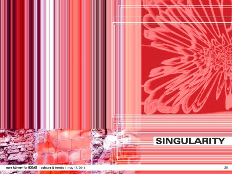
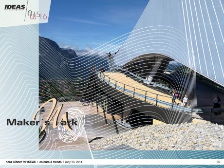
The beauty of new and unseen combinations. Exploring the unfinished to find individual niches. Delighting in reality, drawing inspiration from lucky accidents.
fabrics Material intensity. Highly elaborated fabrics. Small structures are elementary – light reflections bring dense fabrics to life. Soft and skin-caressing stretch materials. Rounded volumes. Velvety handle pairs with a precise metallic sheen.
graphics Breaking borders between genres. Random combinations of motifs and techniques. Expressive, generous all- over prints. Visible vibrations. Diffracted light and hazy looks. Impressionistic blurriness. Undulating lines blown away.
colour mood The range combines both colours of bright intensity and restrained neutrality. Thus creating an extremely vivid colour mood. Red, pink-as-can-be and striking purple dominate the scene. Shades of dark brown, olive wood and grey add shadowy accents. A breeze of mint lends freshness.
Please note:
The complete IDEAS colour forecast autumn I winter 2015*16 (64 pages with graphic inspirations & recommendations for colour combinations) can be purchased exclusively by direct order via e-mail: news@ideas-designers.com.
Looking beyond – Summer 2016
Inspired by the ever growing visual impact of any kind of food, IDEAS selected the word “FOOD” as creative guideline for the season spring/summer 2016. Furthermore food is vital for human beings.
Without food, no energy and no sports!
Food offers an overwhelming treasure of colours, flavours and textures. Transformed into inspirations for sports IDEAS defines two major directions: a wide array of red and pinkish tones as well as fresh blue and aqua tones. Both colour groups explore soft contrasts in depth. Slight powerful accents come from acid yellow and electric blue.
A beautifully balanced pastel colour range plays with light shades of the above mentioned red and blue colour groups.
Please note:
The complete IDEAS colour forecast for spring I summer 2016 will be available by July 10, 2014.
Munich, 26.05.2014
Nora Kuehner
for IDEAS Active Sports Design Network

