Nora Kuehner
fashion design consulting
Secretary General of IDEAS ACTIVE SPORTS DESIGN NETWORK
Presentation at Performance Days show in Munich/ Germany,
November 19, 2013
Colours & Trends
Update Summer 2015 and Preview Winter 2015*16
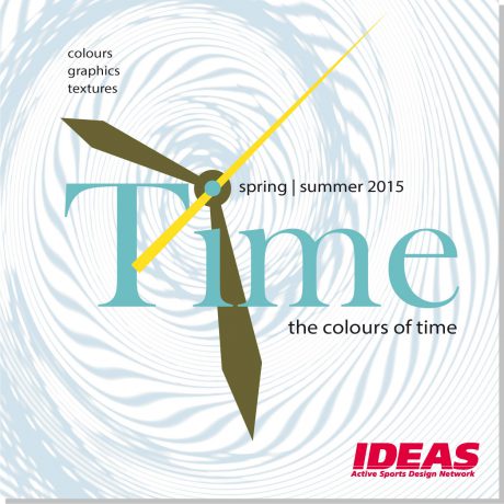
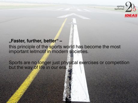
Life without clocks and agendas is hardly imaginable. Constant acceleration seems to go hand in hand with the development of modern societies. Yet does faster mean also better?
As usual IDEAS has set up six colour stories reflecting this rather sporting question in all its ambiguity.
- battling against the clock
Life on the fast track – caught in the trap of clocks, timetables and deadlines. Encased in omnipresent rigorous grids and structures.
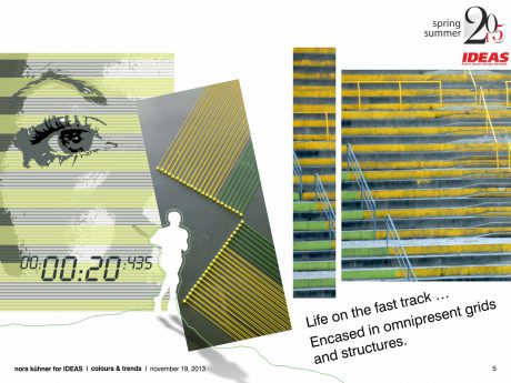
colour mood Vibrant and loaded with energy – sharp yellow and green beat the time of this colour range. Their splendour underlined by dark midnight blue. Combined with muted shades of cinnamon and olive grey. Speed up!
fabrics Perfect functionality & enhanced protection properties. Matte finishes preferred.
Double-weaves & ribstop. Knits made from blends of polyester or polyamide with natural fibres – stretch is added for highest comfort. Customized mesh patterns.
graphic inspiration Multiplying geometric motifs of all shapes and sizes to infinity. Precise stripes give structure to colour planes.
- action shots
Zooming in. Fragmented episodes of daily life – caught by everyone at any time and place.
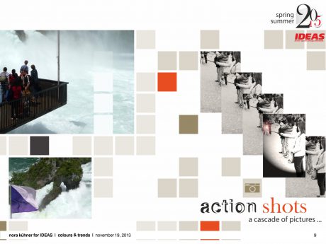
colour mood A subtle range of dense yet slightly hazy summer darks. Contrasted by bluish white.
Lush green adds a touch of nature while injections of orange red energize this delicate and vital colour palette.
fabrics Dense fluidity teamed with slight sturdiness. Engineered 3-layer laminates made from cotton/polyester blends. Foamy summer fleece. Merino blends. Subtly graduated yarn-dyed checks.
graphic inspiration Split-up motifs, individually re-composed. Traditional checks come to life by merging stripes and photographs.
- time out
The glaring intensity of sun-drenched landscapes and a cloudless sky. Moments of contemplation, calm and pureness.
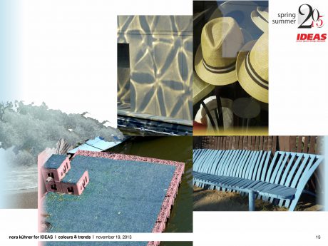
colour mood Softly fading colours with focus on a wide variety of blue and turquoise. Matched with deep earthy brown. Lifted by touches of light chalk pink and radiant yellow olive. Generating a nautical breeze both airy and relaxed.
fabrics A natural dry handle and perceptible structures are key to fabric surfaces. Puffy piqué and basket weaves.
graphic inspiration Inspiration derives from sealife. Mid-scale geometric patterns are easy-going rather than precise. Blurring edges with a soft glow. Scattered planes of colour create vivid abstract patterns. Playing with luminous lines.
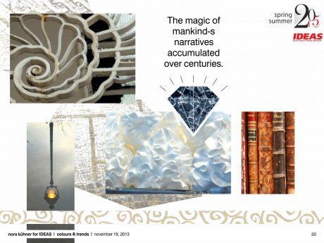
- precious mystery
Fascinated by the mysteries of ancient cultures. The magic of mankind´s narratives accumulated over centuries.
colour mood A colour range whose warm opulence just shows at second glance. Subtle tones of grey, sand, pale indigo and smoky fern pair with chalk white. Lifted with flashes of intensely bright violet and orange.
fabrics Juxtaposing the rough and luxury. A bite of shabbiness. Emphasising long durability. Subdued structures with a touch of extravagance. Raw finishes. Double jacquards and 3D knits.
graphic inspiration A rejection of homogenised design. Decorative patterns take inspiration from tapestries, mosaics, fossils and stone. Shapes inspired by nature are delicately fragmented.
- timeless
Slowing down – breaking the dictate of acceleration. Life follows the personal rhythm generating a lightness of being.
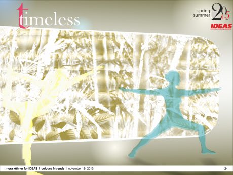
colour mood The colour palette is in perfect balance. Vibrant tones like buttercup yellow, coral red and jacaranda blue pair with pastel turquoise, creamy white and light khaki. Charcoal sets a strong graphic background accent. Timeless beauty at its best.
fabrics Fragile yet solid. Fabrics as natural as possible. Offering a wide variety of tactile sensory experiences. Smooth and fluid powerstretch qualities. Seersucker grades. A hint of colourised sheen.
graphic inspiration A bit of poetry in everyday life. Camouflage-like organic motifs in delicate colouring. Fantasy stripes. Hand-drawn lines follow the silhouettes of plants and flowers. Degradé effects enlighten colour planes.
- high time
Following the arrow of time … Moving forward … Time for real experimentalism. Developing new ideas and concepts for future living.
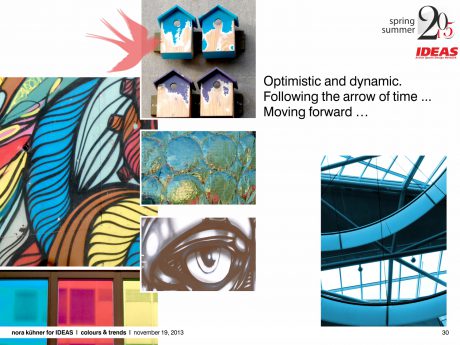
colour mood A vital colour scheme grabbing for attention. Optimistic and dynamic.Cool shades like brilliant aqua and deep sea blue are warmed up by salmon red and saturated burnt brown. Bleached yellow adds light and splendour while intense violet sets quirky accents.
fabrics Material exploration. Defying the confines of traditional industrial manufacturing methods. Transforming and combining are key to fabrics, structures and finishes. New essentials stamped by lightness and comfort for a nomadic society.
graphic inspiration Movement is everything. Leaving complexity behind. Placed colour splashes. The interaction of angular background grids and freely meandering lines creates new spaces and shapes. Geometry in motion. Slightly coloured transparent overprints.
Please note:
The complete IDEAS colour forecast spring I summer 2015 (64 pages with graphic inspirations & recommendations for colour combinations) can be purchased exclusively by direct order via e-mail: news@ideas-designers.com.
Looking beyond – Winter 2015*16
The season is marked by the wish to preserve diversity by thinking beyond mass-production.
People share the desire for singularity – reviving traditional crafts and techniques. Make the difference!
Colours pay tribute to this desire – colouring the season with a very emotionally-loaded vitality.
The major focus is on earthy red tones with all their optimistic and powerful splendour. Paired with cool and fresh shades of blue and green. Cosy and sometimes pearly neutrals underline the delicate and lively mood.
Please note:
The complete IDEAS colour forecast for autumn/winter 2015*16 will be available by
January 26, 2014.
Nora Kuehner
for IDEAS Active Sports Design Network
