Colours & Trends
Update Winter 2016*17 and Preview Summer 2017
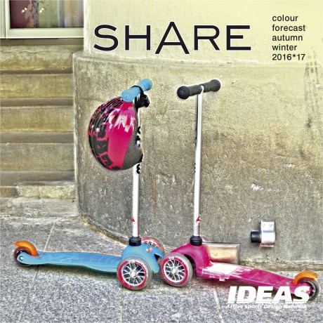
“Sharing” is presumed to be one of the major trends of the future. Its defining feature is exchange. Sharing ideas and insights, goods and services will profoundly change our way of living together.
Rising awareness for the scarcity of natural resources supports the rethinking of socio-cultural settings. Driven by digital connectivity, new patterns of consumption emerge: Access is more important than ownership.
Looking at industries, we see the automotive branch as a pioneer in collaborative practices with the launch of car-sharing. What about textiles? Today´s challenge for the textile industry is no longer to develop loose collections which sell well. We need to rethink the system: centered around creativity, advanced technologies for sustainable and trustful production and the genuine needs of well-informed consumers.
The collaborative input of the IDEAS members for the season winter 2016*17
reflects diverse approaches to the topic. Together we created a luminous winter colour range to brighten up the season. Enjoy!
- TechnoNature
Research and experimentation. Making great strides to decipher nature´s codes and processes to create new solutions for future living.
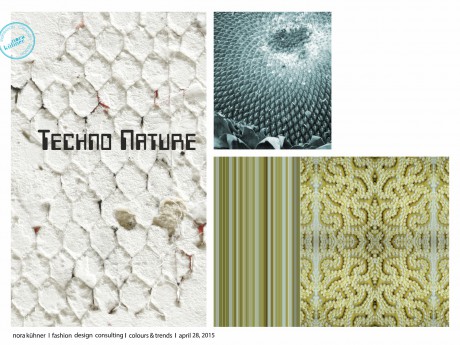
fabrics Developing new materials based on natural processes. Enhancing blends of natural and synthetic fibres. Cotton blends for performance laminates. The interplay of glassy surfaces and porous textures breaks the density of solid fabrics. Granular structures add depth to sleek surfaces. Elaborated stretch fabrics.
graphics Microbiology inspires graphic imagery. Crystallized hybrid motifs. Small-scale geometry plays with distorted perspectives. Straight linearity and powdery overprints.
Micro-embossings and reliefs.
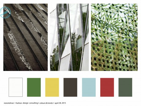
colour mood A range of cold natural tones. Dark brown and shades of mossy green are combined with visually stimulating sulphurous yellow, matt turquoise and earthy red. Chalk white emphasizes the cool undertone of this array.
- synchro:flash
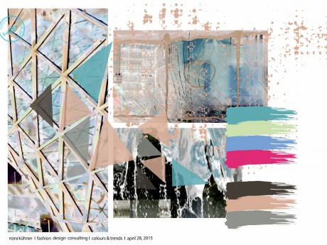
Generating flux. Immersing in colour. Cheerful bright hues or calming matt shades, colour alters both perception and reality. Bringing up narratives of poetic stillness and flashing luminosity.
fabrics Dense 3-layers with a sleek handle. Melange look with irregular flashes of colour. Heavy double-weaves. Sturdy cotton blends with woollen backing. Precise small jacquard structures.
Extremely soft high-pile fleeces. Neoprene like midlayers in spacer technology.
graphics Colour in motion. Dispersed repeats blur plain surfaces. Dripping colour flashes. Fragmented urban motifs play with flickering perspectives. Foil overprints with prismatic reflections.
colour mood Unusual colour pairings. Muted mid tones team with flawless near-neon shades. Lifted with injections of chalk white. A refined interplay creating a dynamic and bright atmosphere.
- less but better
Rethinking the relationship with the environment. Focused on a balanced lifestyle. No sentimental gaze at the past but capturing radically the beauty and essence of a simple life.
fabrics Placing a natural and luxurious simplicity first. Haptic sensations by unrefined treatments mimicking natural structures. Enhancing woollen blends. Heavy yet comfortable weights. Super matt finishes for bonded qualities. Coatings with a cool luminosity. Enveloping voluminous knits.
graphics Patterns meander between organic and ornamental motifs. Exploring colourful geological strata, giving a new twist to scrolls and tapestries. Discreet all-over prints draw inspiration from infinite polar landscapes.
colour mood Calming yet intense colours – at the same time elegant und truly natural. Echoing the clear luminosity of northern winter sceneries. Deep-sea blue highlighted by pale mint and a touch of rose. Coral orange sets powerful accents.
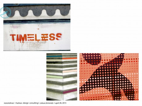
- disOrders
Creating order has turned into an obsession in an over-complex world. Control and structure are key to urban environments. A growing desire for creative chaos, industrial archaeology and traditional crafts questions this rigidity.
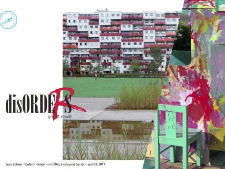
fabrics Anything but flat. A variety of handles, textures and finishes. Oddly textured solid fabrics. Coatings and laminations enhance perceptible structures. Needle punch. Double-faces for shirting. Spacer technology for voluminous meshes.
graphics Prints are inspired by urban topographies which grow and morph on structured plains.
Spray painted fragments of street art and child-like drawings mingle in. Precise geometric lines turn into curvaceous infinite labyrinths. Flawless all over patterns tinged with traces of use.
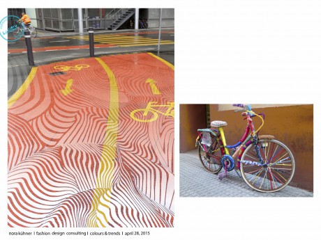
colour mood Loud and brash – a colour palette in full swing. An energetic mix of yellow, red and emerald. The brightness dimmed by soft mauve, hazel brown and blackened navy.
A self-confident reflection of urban turmoil.
- interface
Living the moment – mirroring the caleidoscopic everyday life. A preference for true experiences and emotions.
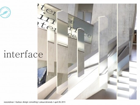
fabrics Weightlessness and flexibility in the centre stage. The solid becomes fluid. Function with a highly aesthetic appeal. A variety of woollen warp knits for extremely light baselayers. Metallic foil effects on PA/PL blends. Slightly polished metallic sheen.
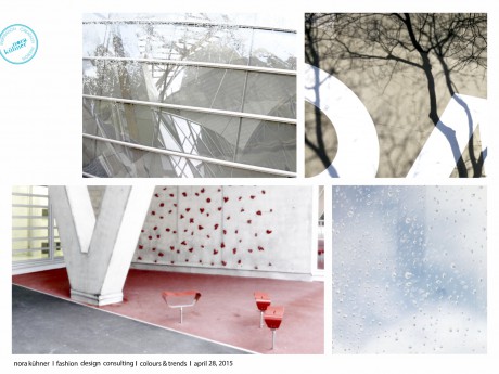
graphics Intricate patterns create spatial illusions. A surrealistic play with light and shadow. Enigmatic encounters of the ordinary. Curved shapes in colour gradation recall volume and depth. Dissolving ornamental line drawings.
colour mood A captivating array of nearly invisible shades of white, pale blue and yellow. Smoky blue and sandy beige add depth. Gorgeous coral lends a powerful twist to this unlikely winter palette and its ephemeral beauty.
- The Rest is Black
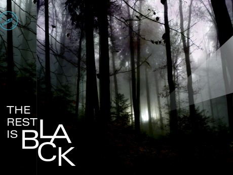
Black – the unmissable backdrop of the digital era challenges common notions. The artefact versus the man-made. Creating irritating imagery – indeterminate landscapes with a fine mistiness and precise phantasmagoric motifs.
fabrics Smart fabrics of all kinds with a casual touch. Heavy knit with resin for outerwear. 3D effects for vivid surfaces – from baselayer to outer shells. Weaves with different yarns create look-a-like ribstops. Tapeable stretch fabrics.
graphics Blending creepy fiction and faded reality. Mutation and fantasy. Creating familiarly strange sceneries and motifs. Spruce-lined forms versus vague reflections. Tracing abstract architectural spaces. Carefully spread light effects.
colour mood Ambiguous darkness with a mysterious edge. Intense blue, copper and misty violet underline the shimmering finesse of this blackened colour range.
Please note:
The complete IDEAS colour forecast autumn I winter 2016*17 (62 pages with graphic inspirations & recommendations for colour combinations) can be purchased exclusively by direct order via e-mail:
colourcard@ideas-designers.com.
Looking beyond: Summer 2017
Growth – a keyword of modern globalized economy. Yet eternal growth is not possible – facing the planet´s limited and shrinking resources mankind has to take action and develop new strategies and models for the years to come. Sharing and collaboration instead of boosting the economy at any cost.
The obsession to measure and count everything by numbers has reached the individual life, too. More and more people are tracking their individual performance 24/7. No wonder that on the other hand side a growing number people are questioning these developments which are becoming the norm.
The designers of IDEAS decided to choose “growth” as their keyword for the season summer 2017 to explore the tensions and contradictions in today´s world. The colours stories they defined are bursting with power and light – always in search of balance without losing energy.
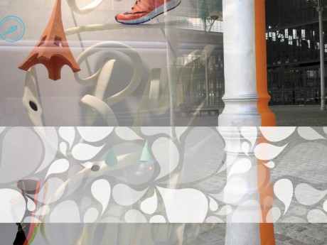
One of the colour stories focuses on the fascination of material development and the changing perception of colours due to new materials. Underlining the fact that colour is key to consumer decisions. The range is dominated by two shades of greenish yellow which pair with luminous aqua and burnt orange. Backdrop colours are shades of grey and fern green. Injections of bright pink support the artificial appeal of this story.
The second story immerses in the subtle beauty of calm and darker shades of natural colours – from intense mint to Delft blue. Pale Plum adds a spicy accent. A story about movement and changes, reflecting the transition period we are living in.
The group´s favourite story is a really aerial interpretation of colour. No pastels – light yet intense shades of vanilla yellow, mandarin and sky blue create a feeling of floating in mid-air. In this story colour and volume go side by side, but colour takes volume to a new weightless dimension.
Please note:
The complete IDEAS colour forecast for spring I summer 2017 will be available
by July 13, 2015. If you are interested in the exclusive preview for early-bird orders, please don´t hesitate to contact Nora Kühner.
Munich, May 8, 2015
Nora Kuehner
fashion design consulting

